Cartographic Colonialism: How Africa Was Resized, Recentered, and Rewritten
Maps are not neutral. For centuries, they’ve distorted Africa’s scale and significance to serve colonial power.
Harriet Comley
7/8/20254 分钟阅读
Most of us grow up believing that maps are neutral. That the image of the world hanging on a classroom wall or projected onto a screen reflects objective truth. But maps are never just about geography. They are about power, perspective, and narrative. And for centuries, the dominant map of the world has told a lie — one that has shrunk Africa, elevated Europe, and subtly conditioned us to see some places as central and others as peripheral.
This is cartographic colonialism: the use of maps to reinforce colonial ideologies, diminish African space, and perpetuate a worldview in which Europe appears large, central, and important — and Africa, quite literally, is made to seem smaller.
The Mercator Projection: A Tool for Navigation, Not Truth
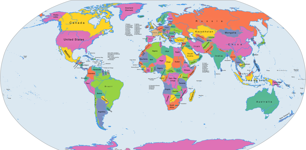
The most common world map in use today — the Mercator projection — was created by European cartographer Gerardus Mercator in 1569. It was designed to aid sea navigation, preserving straight lines for compass directions. But what it preserved in direction, it distorted in size.
Land masses near the poles are dramatically enlarged. Greenland, which is actually smaller than the Democratic Republic of Congo, appears roughly the same size as all of Africa. Europe and North America look bloated, while Africa and South America shrink. This was not designed with malice, but its continued use — particularly in education — reflects an unwillingness to re-center truth over tradition.
A Map of Empire
Colonial powers didn’t just use weapons and treaties to carve up Africa. They used maps. During the Berlin Conference of 1884–85, colonists drew borders across the continent without the presence or consent of a single African representative. These borders ignored ethnic, linguistic, and cultural realities.
The maps produced from this period were not about reflecting the reality of African societies. They were about controlling, extracting, and dividing. Whole regions were marked "unknown" or "unexplored" — despite being inhabited for centuries. Africa became a canvas on which Europe imposed its version of order.
Why Is North Always Up?
One of the most fundamental biases in world maps is the placement of Europe and North America at the top. The convention of "north-up" is arbitrary. The Earth has no top or bottom. Yet by placing Europe on top and in the center, maps visually reinforced notions of superiority. Africa, by contrast, sits below — marginalized, distant, and less important.
Flipping a map upside down has a surprisingly powerful psychological effect. Suddenly, Africa looks dominant. Australia and South Africa are no longer the "bottom of the world." The visual cue of "up" equating to "power" is a deeply ingrained bias few people question.
Maps and the Center: A Global Habit
The tendency to place one’s own region at the center of the world map is not unique to Europe. In fact, the very name “Zhōngguó” (中国) — China’s name for itself — translates as “Middle Kingdom” or “Central Country.” Traditional Chinese maps often depicted China at the center of a square-shaped world, surrounded by tributary states and distant lands. This was not necessarily an act of dominance, but a reflection of how all civilizations tend to orient the world around their own cultural worldview. Whether it’s Europe at the top or China in the middle, maps remind us that perspective is always shaped by history, identity, and power.
Alternative Maps: A More Honest World
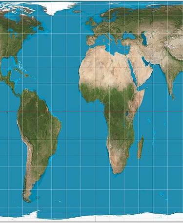
Several alternative map projections have tried to correct this distortion. The Gall-Peters projection, for instance, preserves the true area of land masses, showing Africa and South America in their rightful scale. Others, like the AuthaGraph or Dymaxion projections, attempt to eliminate distortion altogether.
Some educators and African scholars are now advocating for Africa-centered maps that place the continent at the heart of the global image. These are not just aesthetic choices — they are political statements, asserting Africa’s importance and visibility in global consciousness.
Why This Matters
Maps are not just educational tools. They are cultural artifacts that shape how we think about the world. When African children grow up seeing their continent shrunken, pushed to the edge, or surrounded by the language of "lack," it affects how they view their place in the world.
Likewise, when donors, investors, and global institutions see a small Africa, their minds may unconsciously associate the continent with weakness, underdevelopment, or irrelevance. The map has already done the work of diminishing Africa’s stature.
Reclaiming the Frame
To confront cartographic colonialism is to reclaim the right to tell our own story. Africa is not marginal. It has always been a center of human history, culture, trade, and civilization. The maps we use must reflect this.
We must teach children multiple maps. We must question what is presented as objective. And we must begin to redraw not just borders, but the frame itself. Because until Africa takes its rightful size and place on the map, it will remain symbolically small in the world’s imagination.
And that is a lie we can no longer afford to live with.